
 1733
1733
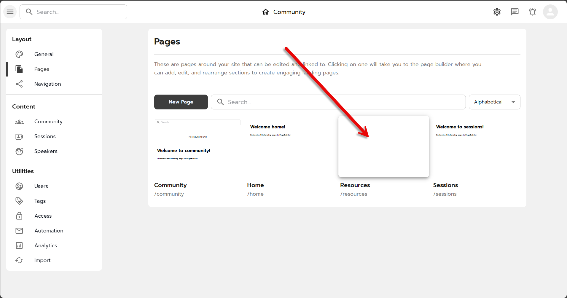
By default there are three pages set up in your new Community site: Community, Home, and Sessions. You can create links for these pages and add them to the top header navigation for your site, and you can create as many Pages as you like.
To create a new page:
- Click the New Page button.

Creating a new page in Community. - Give the page a name; the slug will auto-fill.

Naming our new Community page. - Click Create to complete creating the page.
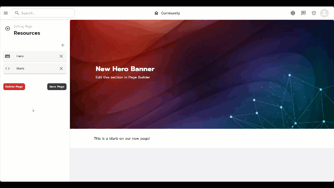
To add content to your new page, click the page preview (this may be blank for a new page).
To add content to your new page:
- Click the plus icon and select the type of content you wish to add to your page.

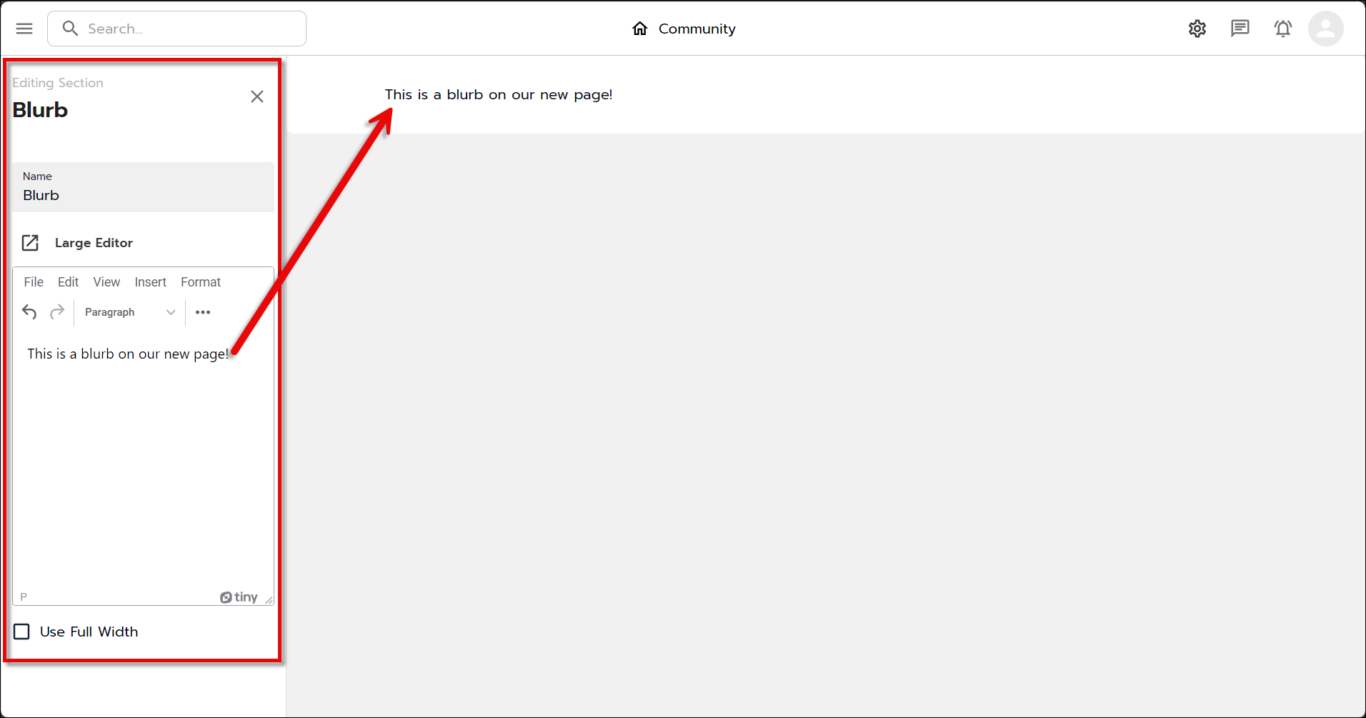
Adding a content type to your page - Blurb: Blurbs are sections of text that you can place anywhere on your page. They can be descriptive or informative, have several rich text formatting options, and can include links, media (such as embedded videos), emojis, and horizontal lines to break up the text. You can click the Large Editor link to open a larger editing window for easier formatting. To close the Large Editor, click anywhere outside the editor window.

What the Blurb editor looks like when you click the Large Editor link. 
A Blurb with formatted text, a horizontal line, and an embedded video. - Directory: this option will drop a directory of all members that belong to a Community group (i.e.. any GrowthZone contact that belongs to a list that has the Show Community Option in Info Hub option enabled).

Our Resources page showing the Directory section editing menu. - Name: Changing this will modify the name of the section
- Title: Adding text here will add a header at the top of the directory with the directory title.
- Show saved users: This will toggle visibility of the Saved Contacts at the top of the directory. Members can save users by enabling the bookmark icon
 to the right of their listing so it fills in:
  .
. - Show recommended users: This will toggle visibility of the Recommended Users section of the directory.
- Filter by Interest: Any Interests that members have entered in their Community profiles will appear here as options to select for search filters.
- Filter by Skill: Any Skills that members have entered in their Community profiles will appear here as options to select for search filters.
- Number: You can select how many members appear on a page of the directory by selecting a number from this dropdown menu.
- Global Feed: This will add a feed of Community member posts to your page. Other members can search and order posts, and like, comment, and share posts; the posting member can edit their post, make the post an announcement or remove the announcement; or delete their post.
- Edit: this will open the editor and allow the original poster to edit their post.
- Pin a Post: this will move the post to the top of the feed regardless of the sort option selected.
- Make an Announcement
- Global Discussions: Similar to the Global Feed, this option allows members to initiate conversations with others. Other members can follow the topic and share the topic to initiate further dialogue.
- Grid: Will display the various courses you offer. Within the Grid tab, you can update the component name, add a title, and configure tabs to help users navigate different sets of content. For more information on Learning Courses, please view the Learning Module Overview article.
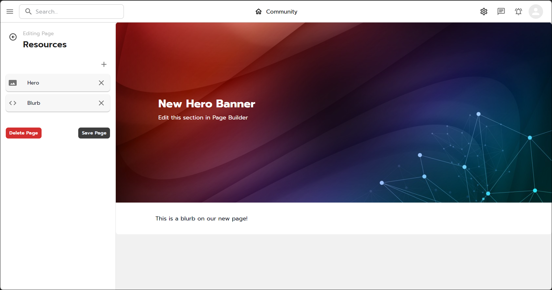
- Hero: this is a banner that can appear anywhere on your page. You can use the default background image or upload your own, change the alignment of the text, and change the size of the banner; you can add a button and link it either internal (other pages or Community content) or external (websites, links, etc.) resources as well as change the button text and color.

A page showing the Hero banner options and the button/link options in the flyout menu. - Rotator: Rotators cycle through different content on your site, displaying multiple pieces in a single space and potentially increasing exposure.

A Rotator module and options - Schedule: displays scheduled sessions (video chats)
- Side By Side: Gives an option to display an image + text in a side by side manner. You can align the image to the left or right side.
- Blurb: Blurbs are sections of text that you can place anywhere on your page. They can be descriptive or informative, have several rich text formatting options, and can include links, media (such as embedded videos), emojis, and horizontal lines to break up the text. You can click the Large Editor link to open a larger editing window for easier formatting. To close the Large Editor, click anywhere outside the editor window.
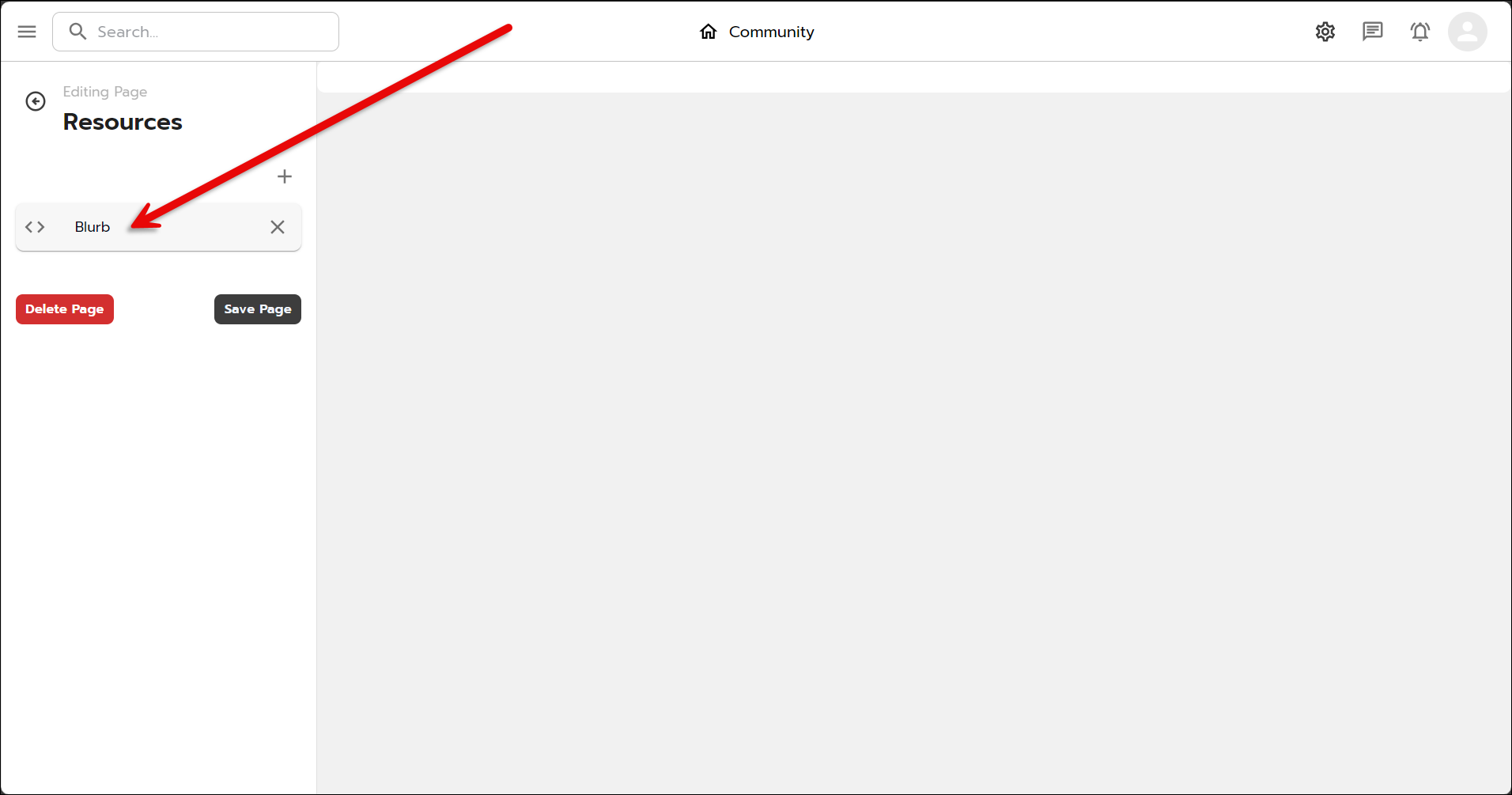
To edit the content type, click the content type: this will open the Editing Section flyout.
As you add content to the Editing Section, it will appear on the page preview pane to the right.
Click the X to close the flyout pane.
You can add more content to your new page by clicking the plus icon and selecting another content type.
You can change the order of the content items by dragging and dropping them into the order you prefer. The page preview pane on the right will update as you reorder the content!